Toolpad Core
Full stack components
for React |
From the creators of Material UI, Toolpad Core offers the components needed for your next admin panel and internal tools project. Bootstrap from scratch in our CLI with well chosen defaults, or drop Toolpad Core into your existing Next.js or Vite project.
Features
Components which integrate the full stack
Quickly build admin interfaces with a set of components that are designed to work together.
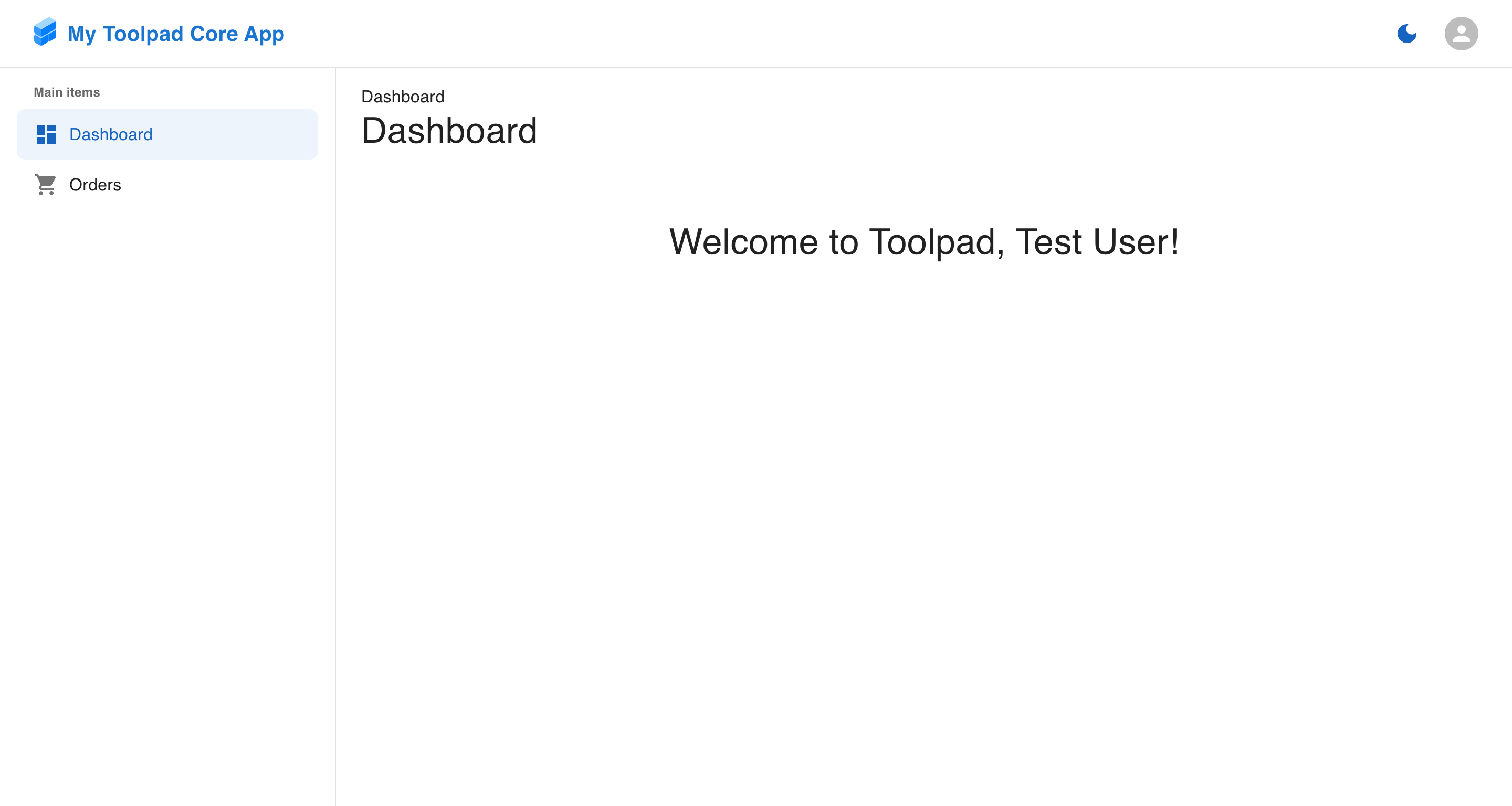
const NAVIGATION: Navigation = [
  {
    kind: 'header',
    title: 'Main items',
  },
  {
    segment: 'dashboard',
    title: 'Dashboard',
    icon: <DashboardIcon />,
  },
  {
    segment: 'orders',
    title: 'Orders',
    icon: <ShoppingCartIcon />,
  },
  {
    kind: 'divider',
  },
  {
    kind: 'header',
    title: 'Analytics',
  },
  {
    segment: 'reports',
    title: 'Reports',
    icon: <BarChartIcon />,
    children: [
      {
        segment: 'sales',
        title: 'Sales',
        icon: <DescriptionIcon />,
      },
      {
        segment: 'traffic',
        title: 'Traffic',
        icon: <DescriptionIcon />,
      },
    ],
  },
  {
    segment: 'integrations',
    title: 'Integrations',
    icon: <LayersIcon />,
  },
];

function DashboardLayoutBasic(props: DemoProps) {
  const { window } = props;

  const [pathname, setPathname] = React.useState('/dashboard');

  const router = React.useMemo<Router>(() => {
    return {
      pathname,
      searchParams: new URLSearchParams(),
      navigate: (path) => setPathname(String(path)),
    };
  }, [pathname]);

  const demoWindow = window !== undefined ? window() : undefined;

  return (
    <AppProvider navigation={NAVIGATION} router={router} window={demoWindow}>
      <DashboardLayout>
        <PageContainer>
          <Grid container spacing={2}>
            <Grid size={6}>
              <PlaceHolder height={100} />
            </Grid>
            <Grid size={6}>
              <PlaceHolder height={100} />
            </Grid>
            <Grid size={12}>
              <PlaceHolder height={200} />
            </Grid>
          </Grid>
        </PageContainer>
      </DashboardLayout>
    </AppProvider>
  );
}
Why build with Toolpad?
Leverage the best
in the ecosystem...
React
Toolpad is a code-centric approach to admin apps. The entire app is accessible and customizable through React code.
TypeScript
TypeScript enhances code maintainability and developer productivity, making it a preferred choice for Toolpad apps.
Next.js
Next.js sets the industry standard for modern React applications. Building over it is a leverage that makes Toolpad efficient.
Material UI
A tight integration with Material UI ensures you get all the latest features from our list of Material UI components.
Examples
Toolpad Core is ideal for building